Aotea Kai Partners
Use the full name on first mention. Use Aotea Kai after that where the context is clear.
Brand and media
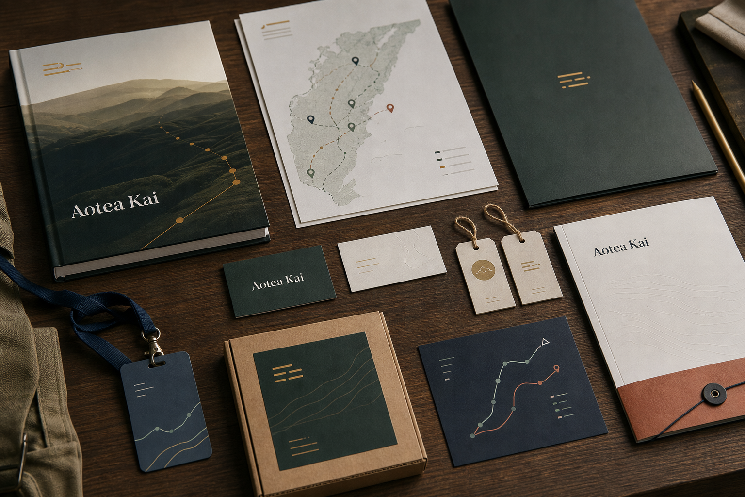
Aotea Kai is practical, regional, commercially serious, and careful with public claims. Our identity follows the same rule: useful before decorative, grounded before glossy, and clear enough for people outside the room to understand.
Use the full name on first mention. Use Aotea Kai after that where the context is clear.
This line is a company posture, not a seasonal campaign. It should sit beside practical evidence of how the pathway works.
Aotea Kai Partners is an Aotearoa food and wellbeing pathway company helping regional producers reach better-fit markets through partnership, market translation, logistics coordination, quality proof, commercial discipline, and reinvestment.
Identity system
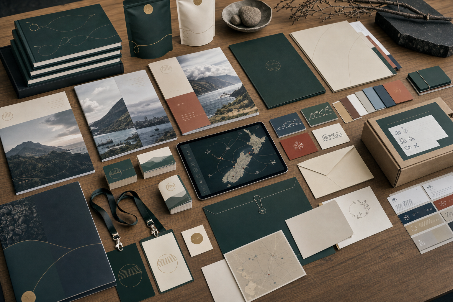
Reports, route cards, producer folders, media packs, cold-chain notes, partner briefings, and recruitment material should all feel like one company: practical, serious, warm, and specific to the work.
Logo system
The circular pathway mark represents movement with restraint: producer to market, market back to producer, relationship carried both ways, and value returning through the network. It is the mark we use when we need the company to feel practical, trusted, and recognisable at a glance.

Use on light backgrounds, public documents, report covers, and partner-facing material.

Use when the page or document already provides the light background field.

Use on dark green, route navy, or image overlays where contrast is clear.
Use for tight placements, report back covers, partner folders, and square-format layouts.

Use as favicon, social avatar, report spine, small stamp, or app-style symbol.

Use the one-colour or reverse mark for embossing, small stamps, dark fields, and production uses where detail must stay clear.
Colour and tone
Working green anchors the company. Route navy carries proof and systems. Return gold marks movement and value return. Clay keeps working texture visible. Mist and paper keep reports, maps, and documents warm without turning the identity into a lifestyle palette.
#17201dText#17362fCorporate#245044Pathway#16364aProof#b9974fLinework#b65e4aHuman heatPublic voice
We describe the company through work people can see: routes, records, decisions, products, producer confidence, and market discipline.
Route, proof, readiness, value return, producer pathway, market fit, handoff, review, reinvestment, relationship.
We do not describe ourselves as frictionless, disruptive, world-leading, or transformational unless the evidence can carry the claim.
Terms such as kai, manaaki, utu, whenua, and kaitiakitanga should sit beside real decisions, obligations, and records.
Use people who look lived-in, busy, and distinct. Preserve age, weather, focus, and working texture.
Offices, cold rooms, producer sites, wharves, route desks, market visits, reports, and public meetings all belong.
Show product readiness, packaging, proof, route handling, and category fit without turning the website into a catalogue.
Design standards
Aotea Kai materials should feel designed, but never decorative for its own sake. The identity works best when it supports judgement: what moved, what was proved, what was selected, what returned, and what is developing next.
Give the route-and-return mark enough room to breathe. It should not be crowded by badges, slogans, partner logos, or decorative icons.
Use offices, route boards, cold rooms, producer sites, wharves, product-readiness tables, public meetings, and reports. Avoid making every image a plate or a smiling group.
Evidence, maps, route cards, report pages, quality notes, and claim records should feel legible and serious, not like a generic infographic pack.
Use serif headlines for public gravity and sans-serif detail for decisions, figures, captions, navigation, and notes. Do not over-scale type inside compact controls.
Downloads
Logo, colour, typography, imagery, public voice, and application rules for consistent use.
Open standardName, logo, colour, image, voice, and public description rules.
Open guideCompany description, contact routes, logos, and publication notes.
Open media packCurrent public leadership headshots and team image for media and partner reference.
Open image packPrimary light-background logo for reports and public pages.
Open SVGTransparent horizontal lockup for web and document placements.
Open SVGLogo for dark backgrounds and image overlays.
Open SVGCompact lockup for square-format use and partner folders.
Open SVGSmall-format circular pathway mark.
Open SVGStamp, embossing, low-colour, and small-production use.
Open SVGThe public report that gives the brand its evidence base.
Open report